After years of being seen as nothing more than a public utility and losing outbound flights to neighboring airports, it was time for a rebrand. The competitive position for BTR is its close proximity and no-hassle check-ins and procedures, so the logo had to be simple, clean, and bold. The two-word slogan is also simple but impactful.
Print
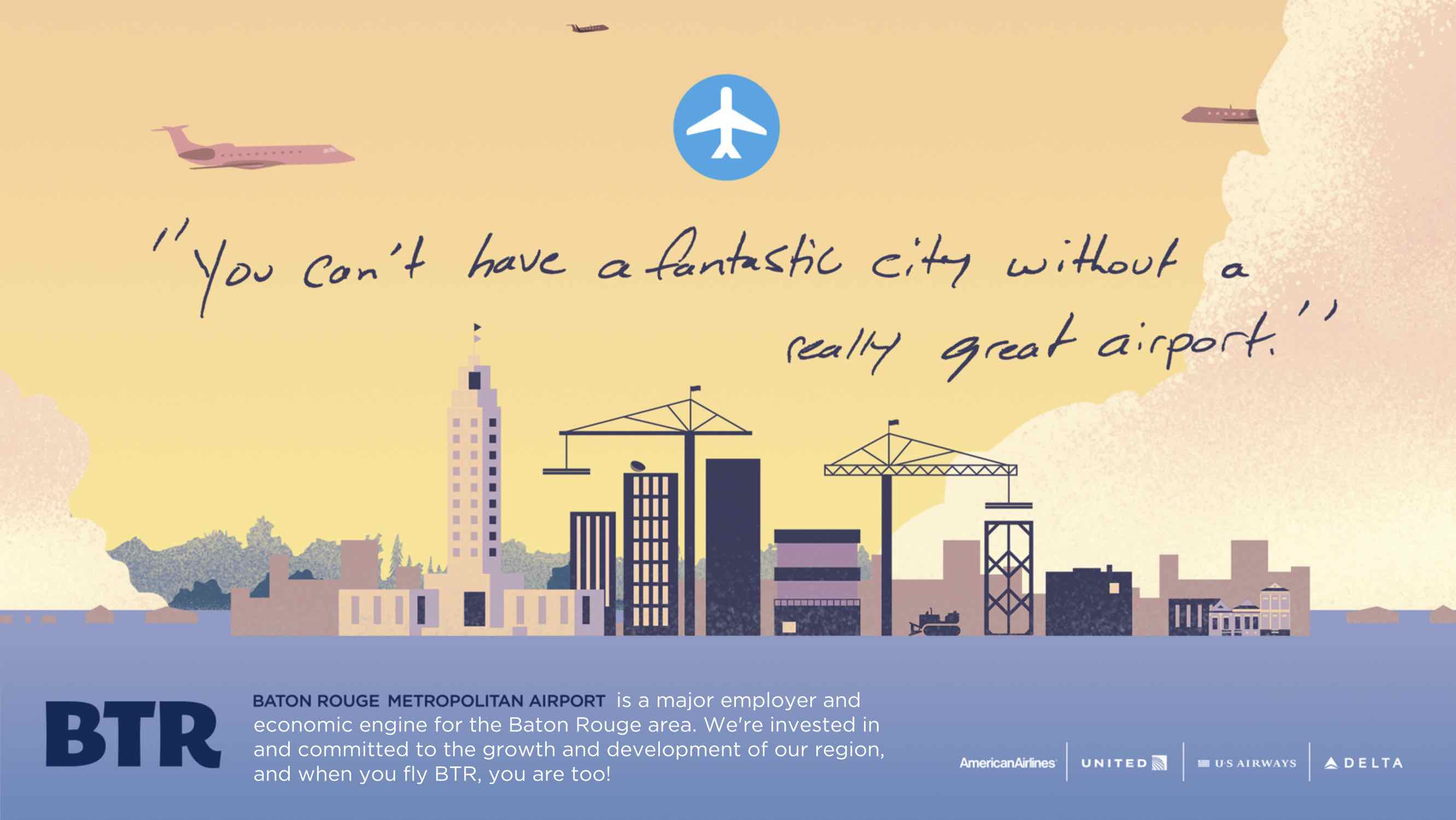
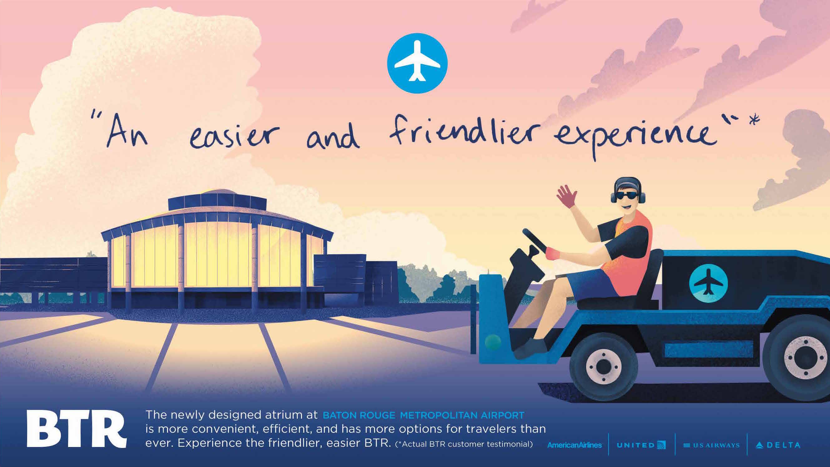
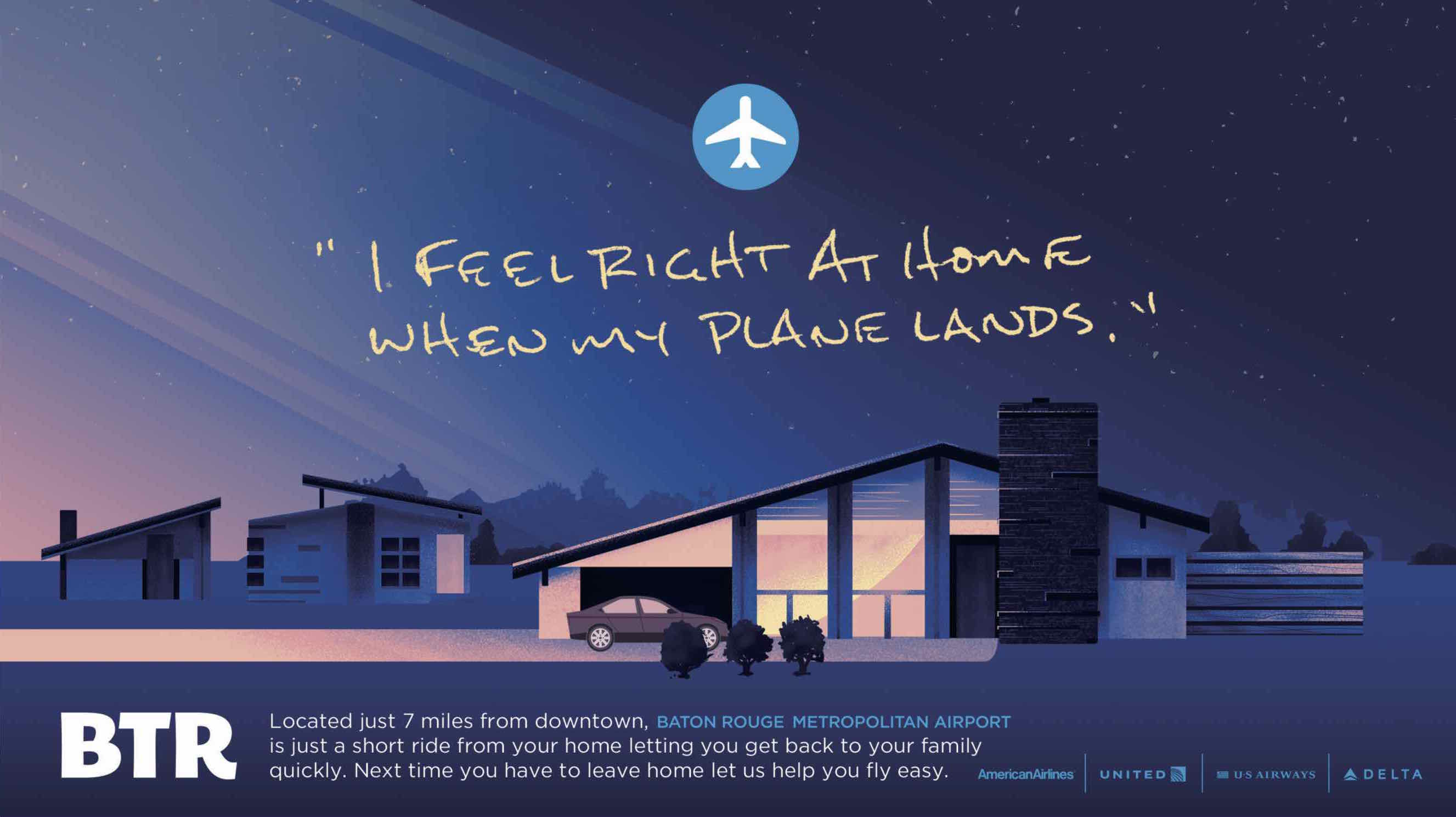
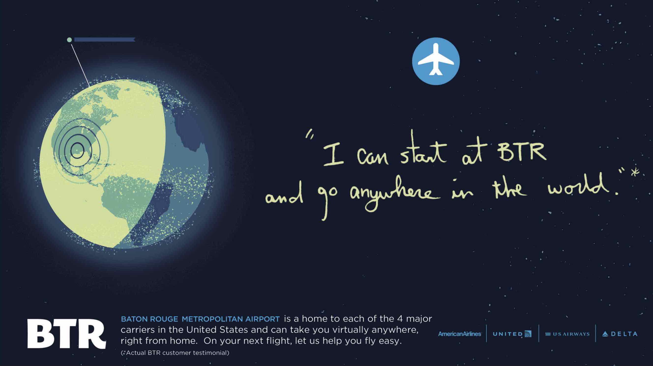
We let testimonials guide our creative message in this campaign. Each ad highlights a different aspect of the airport that leaves real customers impressed: Economic impact, easy experience, travel destinations, and proximity to home. The visual style is modern and minimalist with striking colors and layout. Hand-written headlines help communicate that these are real testimonials.
Outdoor
We used the same visual style from the print, but used a condensed quote so that it’s quick to read and comprehend while on the road.
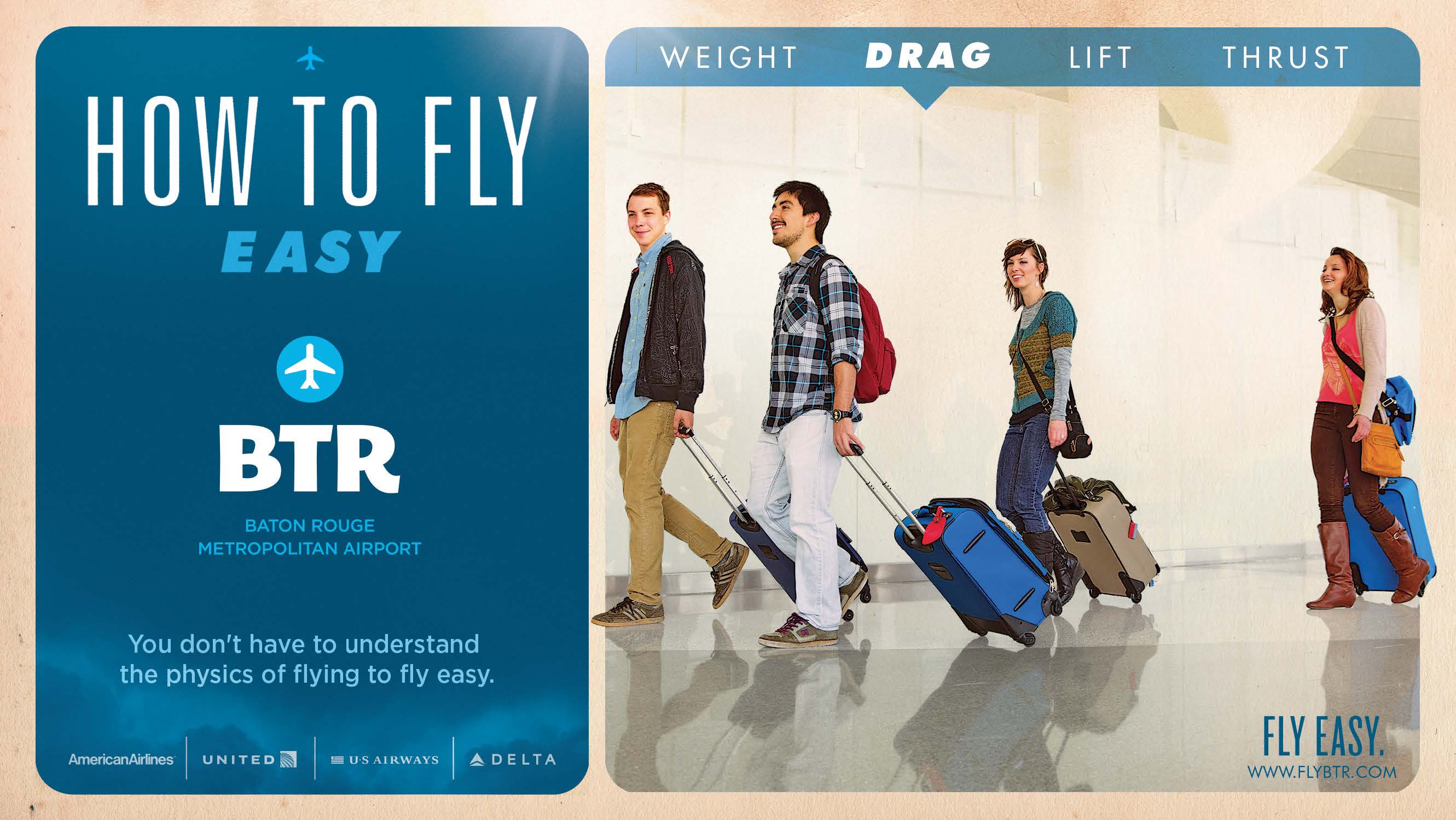
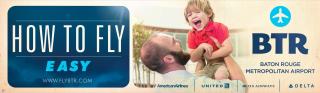
Print
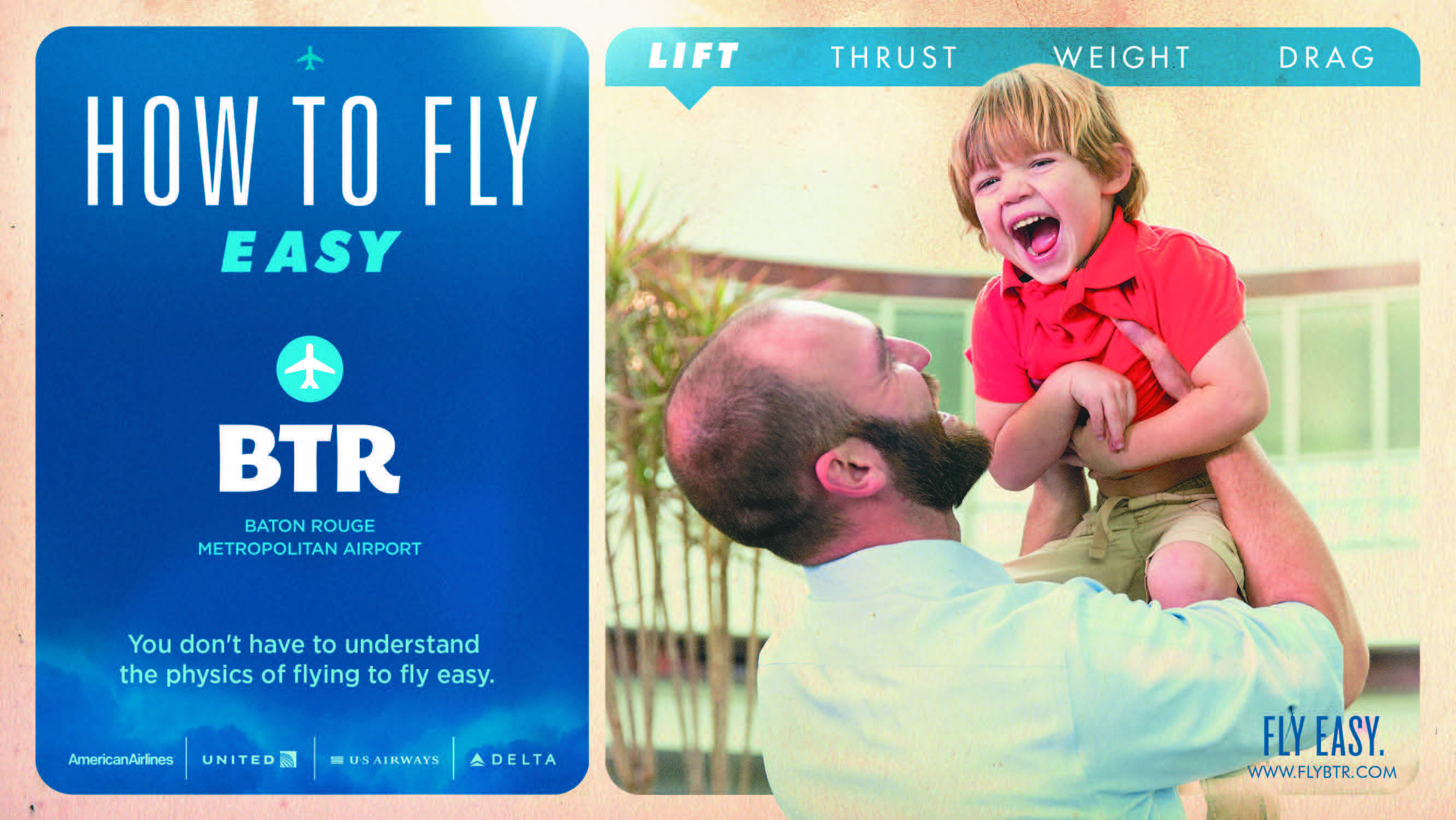
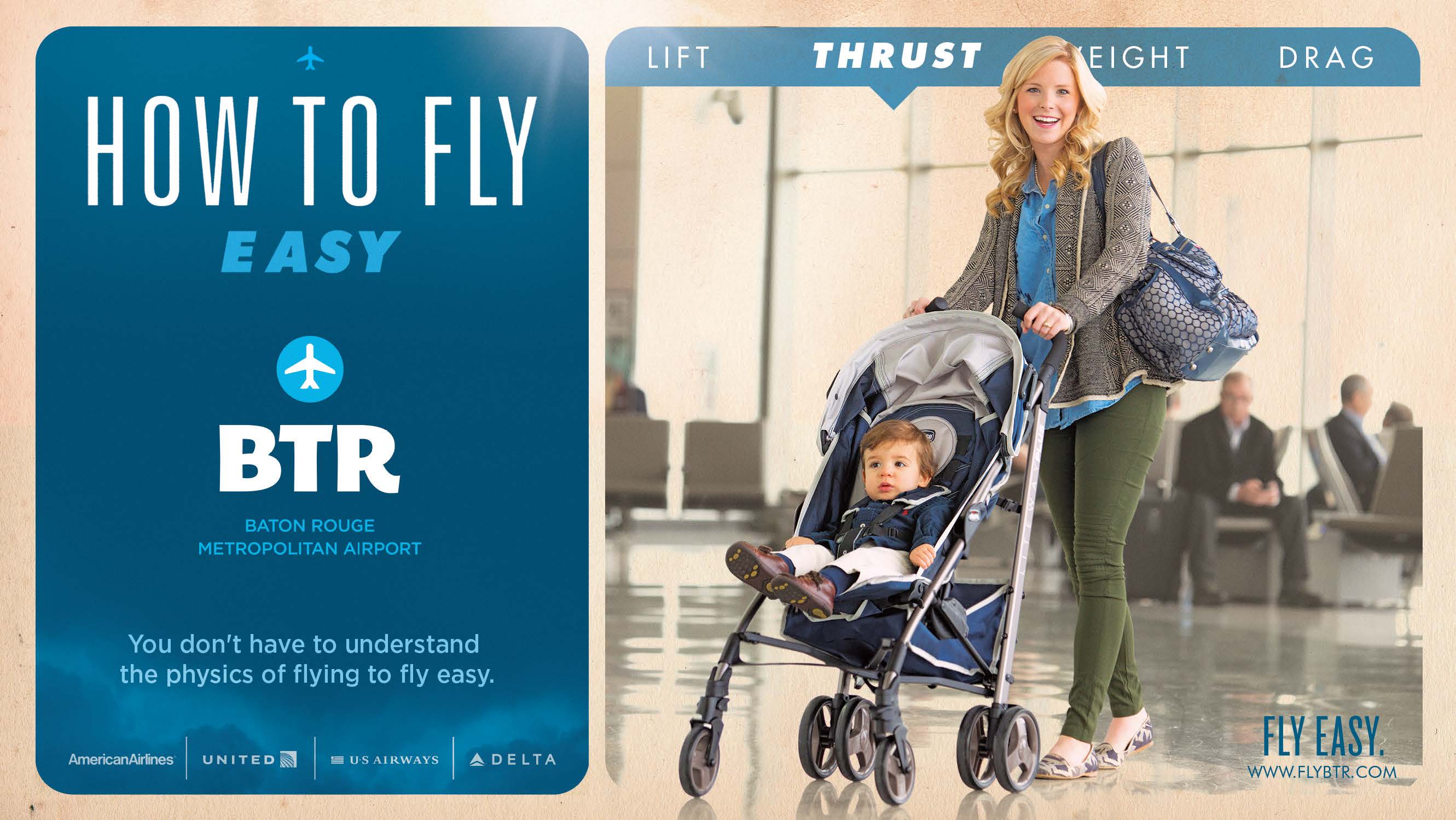
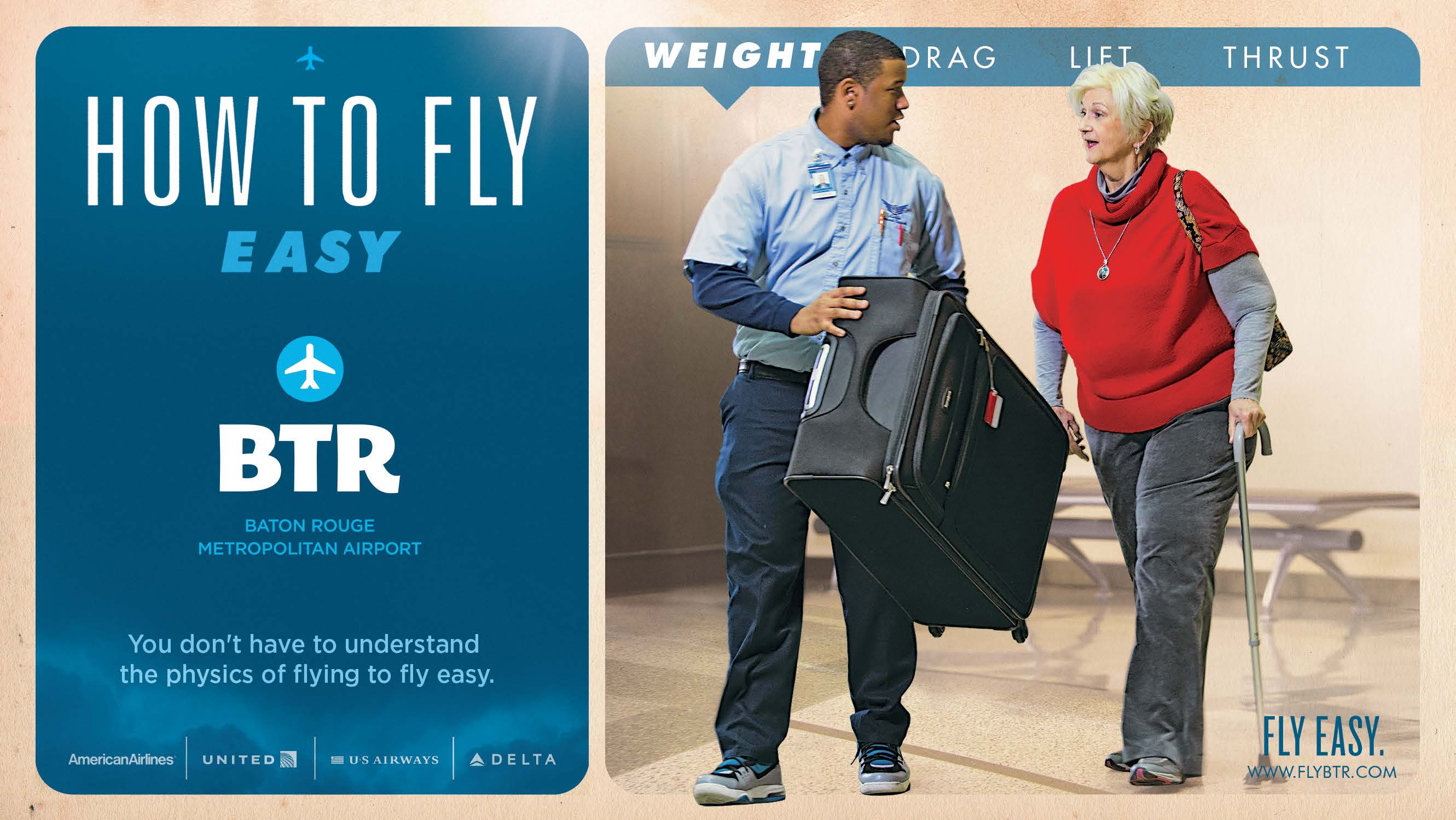
Using the physics of flight as our hook for this campaign, each ad focuses on a different aspect, but we relate it to your personal experience. Lift, thrust, weight, and drag are displayed in a light, casual, and easy-going format for “How to Fly Easy.” The ads are people-focused rather than the physics or the facility, although the new atrium is showcased.
Outdoor
The out of home campaign mirrors the print and the TV spot. Where the board is limited in its ability to tell a story, strong, giant images evoke the same feelings of light and casual ease at BTR.
Helping Companies Invest Marketing Dollars Wisely
If you want to grow your business, manage change, or hear about what's possible for the future, we’d love for you to fill out our contact form and one of our brand marketing experts will be in touch.